Charts
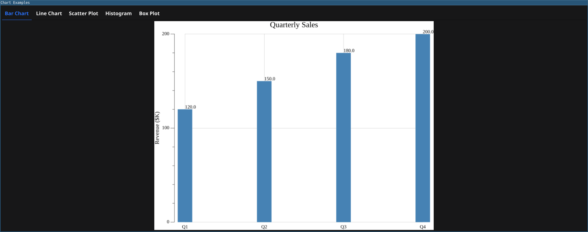
This example demonstrates the various chart types available in fynerisor: bar, line, scatter, histogram, and box plot.
Features
- Bar Chart: Display categorical data with rectangular bars
- Line Chart: Show trends over continuous data
- Scatter Plot: Visualize individual data points
- Histogram: Show distribution of numerical data with a normal distribution overlay
- Box Plot: Compare distributions across groups with fitted normal distribution curves
Code
require(["v0.6"])

// Resize window for better chart viewing
window.Resize(1000, 800)

// Bar Chart
let barChart = chart.NewBarChart(
    "Quarterly Sales",
    "Revenue ($K)",
    ["Q1", "Q2", "Q3", "Q4"],
    [120, 150, 180, 200]
)

// Line Chart
let xvals = [1, 2, 3, 4, 5, 6, 7, 8, 9, 10]
let yvals = [10, 15, 13, 17, 20, 22, 19, 25, 28, 30]
let lineChart = chart.NewLineChart(
    "Growth Over Time",
    "Month",
    "Revenue ($K)",
    xvals,
    yvals
)

// Scatter Plot
let scatterX = [1, 2, 3, 4, 5, 6, 7, 8, 9, 10, 11, 12]
let scatterY = [12, 16, 15, 18, 22, 19, 23, 27, 25, 30, 28, 32]
let scatterChart = chart.NewScatterChart(
    "Data Points",
    "X Variable",
    "Y Variable",
    scatterX,
    scatterY
)

// Histogram with Normal Distribution Overlay
let histData = [
    1.2, 1.5, 1.8, 2.1, 2.3, 2.5, 2.7, 2.9, 3.1, 3.3,
    3.5, 3.7, 3.9, 4.1, 4.3, 4.5, 4.7, 4.9, 5.1, 5.3,
    2.2, 2.4, 2.6, 2.8, 3.0, 3.2, 3.4, 3.6, 3.8, 4.0,
    4.2, 4.4, 4.6, 4.8, 5.0, 5.2, 5.4, 5.6, 5.8, 6.0
]
let histogram = chart.NewHistogram(
    "Data Distribution with Normal Curve",
    "Value",
    "Frequency",
    histData,
    15
)

// Box Plot with Normal Distribution Curves
let groupA = [12, 14, 15, 16, 18, 19, 20, 21, 22, 24, 25, 28]
let groupB = [15, 17, 18, 20, 22, 23, 24, 25, 26, 27, 29, 30]
let groupC = [10, 11, 13, 14, 15, 16, 17, 18, 20, 22, 23, 25]
let boxPlot = chart.NewBoxPlot(
    "Group Comparison with Normal Distributions",
    "Values",
    ["Group A", "Group B", "Group C"],
    [groupA, groupB, groupC]
)

// Create tabs for different charts
let tabs = container.NewAppTabs(
    container.NewTabItem("Bar Chart", barChart),
    container.NewTabItem("Line Chart", lineChart),
    container.NewTabItem("Scatter Plot", scatterChart),
    container.NewTabItem("Histogram", histogram),
    container.NewTabItem("Box Plot", boxPlot)
)

window.SetContent(tabs)
Running
cd examples/35-charts
go run main.go
Or with the fynerisor CLI:
fynerisor main.risor